


…It’s gotta look good too!
Anybody with an internet connection has seen that website. The one that hurts your eyes. One where you can barely read the words, or doing so requires far more effort than your under-caffeinated brain is willing to give. The words are overlaying a too busy image, or placed awkwardly, or in a font that you’ve gotta squint your eyes to read. It’s not what’s being said, not the copy, but how it’s being displayed. The problem is the typography.

Typography is the art of arranging text in a legible way where line spacing, font choice, kerning and logical hierarchy are all performed in the name of a visually appealing reading experience. It’s equal parts graphic design and effective communication. Your brand can benefit greatly from its use, or have to deal with the consequences of its failing. Typography is as old as the written word and, in its own way, just as necessary as the text itself. It controls the mood of the copy, and if the copy can be even read at all. It’s how the word is made visual.
It’s also a topic that’s frequently neglected in favor of its flashier cousins, graphic design and copywriting. The thing is, it’s equally as important as those guys, and just as fascinating to study.
So let’s consider this blog an opportune time to really dig into the importance of typography, and also how to best utilize it in your website and advertising.
Choosing the right typeface, font size, and spacing can make a huge difference in your user experience and overall effectiveness of your website.
-
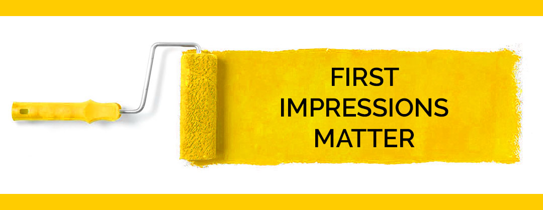
First Impressions
Typography is the first thing your visitors will notice when they land on your website. Your site may have amazing copy, but those great words aren’t gonna get read if they aren’t beautifully presented. Your words have to make a great first impression. What does that mean with regard to typography? In short: It means a great looking font that communicates your message clearly. Words that are positioned to create a flow to your website, and enhance readability.
-
Readability
Keeping your words legible and understandable are also key considerations in your typography. Font size, spacing and contrast between text and background across platforms must all be taken into account. Certainly you wouldn’t want the text arrangement on your desktop site to be the same on mobile. Visitors should never feel compelled to zoom in on mobile. Your text must be readable across channels. Your text must also be you!
-
Meaning Beyond the Meaning
Text has personality, and great typography informs the reader of its intent before they even start reading. Your typography of choice should align with, and magnify, your intentions. Your font needs to relate to your business. If your brand is all about the fun things in life, your font should reflect that. That doesn’t mean balloons and emojis as far as the eye can see, rather it means choosing a font that isn’t too serious or heavy. Conversely, if your brand deals in more serious matters, or something more traditional, then your font choice should reflect that as well. Typographical choices align with your brand and have the ability to impress your brand’s personality upon readers right at the outset.

-
Bringing It All Together
Typography is also useful in unifying your brand. From logo to content, your overall design aesthetic is heavily reliant upon typography. Because words make up a majority of most websites, there is ample opportunity to tie everything together through its presentation. Organization of text on the screen is of utmost importance, as is finding the perfect font, or combination, and sticking with it. A lack of both can lead to feelings of clutter and confusion for your readers. The last thing you want from potential clients or customers is the desire to get away as soon as possible.
-
Web Worthy
A web-safe font is also necessary. Keeping it readable across platforms, and changing as needed, is important, but so is artistry and attention to aesthetics. Arranging your text on the screen in a natural way that makes sense is also key. Great typography on your website will create a natural flow of ideas and a visual hierarchy. Logical progressions of thoughts feel right when you see them.
Typography has been used in text for thousands of years, and truly solidified with the invention of the printing press. As the digital age continues to dawn, and typographical options for text continue to branch into new avenues, the age-old rules still remain. Keep it readable, logical and visually appealing.