


The world of design never stops spinning. Last year’s shiny new trends become this year’s old news in a blink. Truthfully, it’s damn near impossible to stay on top of it all without the help of your favorite online creative branding agency in Dubai.
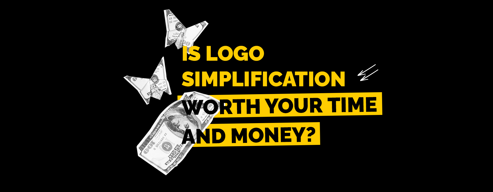
One particular recent design trend has sparked both excitement and debate: logo simplification. Companies are ditching their previously elaborate, intricate emblems for designs that are increasingly minimalistic and streamlined. It’s happening across industries and, like any design evolution, it’s got its advocates and detractors. Some will say that logo simplification increases brand recognition and loyalty, while others will say it can be perceived as lazy and lacking that certain creative spark evident in brands of old.
No matter your opinion on logo simplification, there’s no denying the fact that it’s everywhere! So let’s talk about it and find out if logo simplification is worth your time and money.
- Simple Truths
- Everything Everywhere
- Keeping Trendy
- Forward or Backward?
Brands need to be memorable from the start, so it’s no wonder that simplification has become as popular as it has. Increased memorability helps viewers remember what they’ve seen, and make instant brand associations. However, oversimplification risks the opposite reaction: simply being too plain to make much of an impression on consumers.
The simplified logo is more adaptable across platforms and media and, honestly, in an era of digital devices and ever-shrinking screen sizes, an intricate logo simply won’t be able to communicate as well. When scaled down, your logo should retain its clarity and legibility even at thumbnail size. Consistent branding across mediums often means simplification, quite literally plain and simple.
Simplifying your logo may also be a response to evolving trends in branding. Audience tastes shift with time, and younger audiences gravitate toward minimalism. After all, our aesthetic tastes are influenced by our surroundings, and we spend more and more time online and with our smartphones. The slow, steady rise of minimalist design reflects a cultural shift toward visuals that reflect clarity, simplicity and modernity. Of course, the pendulum is ever-swinging and we’ll likely be back to favoring detailed, ornate branding in short order. For right now, simple is where it’s at.
Logo simplification has, of course, received pushback from some critics and designers, and certainly not without reason. Simplification can be seen as a form of brand regression that denies the forward progression of technological and design progress. However, the essential goal of a logo is to ably convey a brand’s values, establish recognition and create an emotional connection with consumers. In this way, simplifying your logo shouldn’t represent a loss of that creative spark. Rather, this simplification should be seen as an example of your adaptability to a changing visual landscape, as well as your ability to connect with the widest possible audience.
As the trend of logo simplification has taken hold of the global market, many well-known brands have hopped on the bandwagon. Needless to say, some rebranding efforts have been better than others, but it’s certainly been fascinating to witness, especially when you understand the motivation behind the change.
Here are some examples…
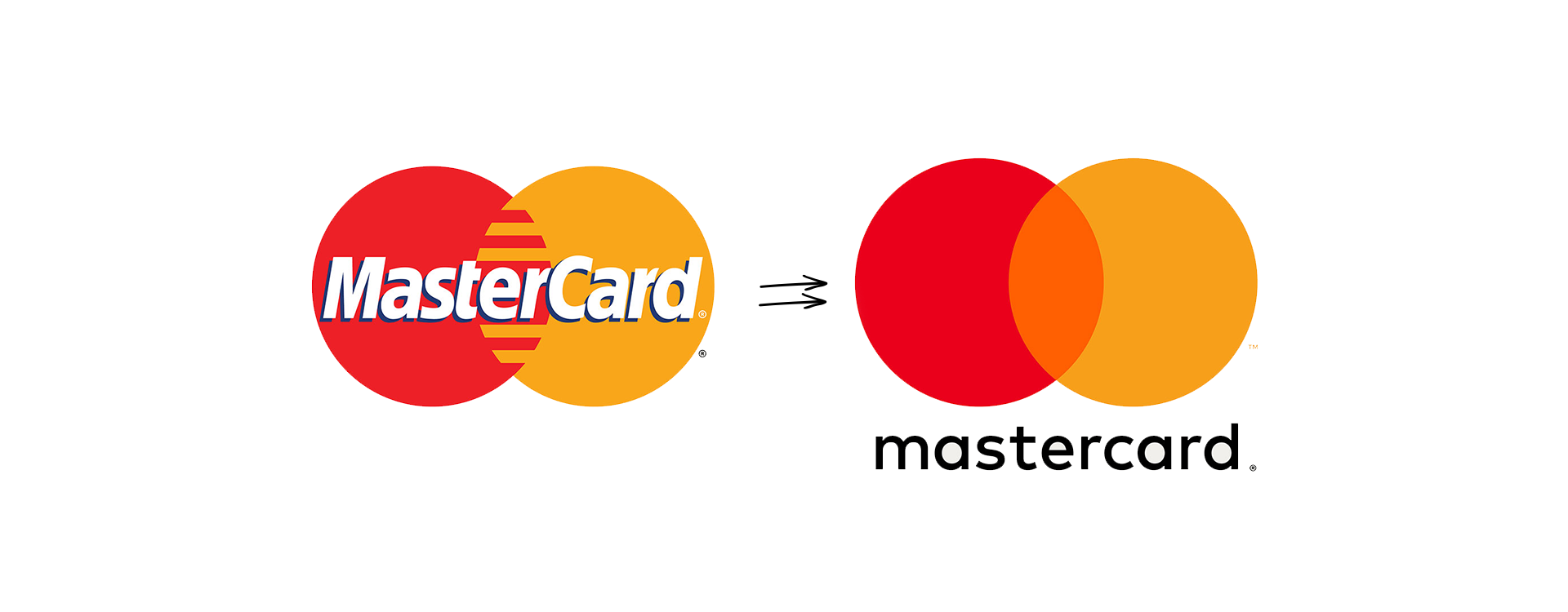
In 2016, Mastercard unveiled their first logo change in twenty years. At this point in their history, the company had one of the more recognizable in the world, thus a cleaner look free of anything potentially seen as unnecessary was kind of a no-brainer. And, in our era of tiny screens, the new logo was readable at any dimension.

Spotify, still the #1 music streaming service globally, has evolved their logo considerably since their inception. From a more immediate shade of green, to a more easily recognizable icon, the brand has changed to fit the times.
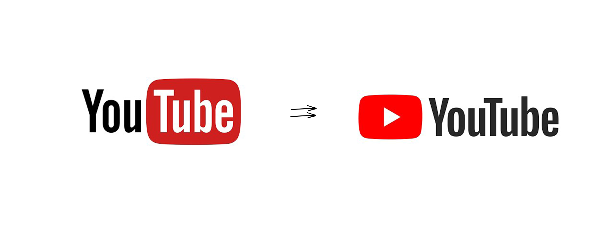
By now you may be sensing a theme at work here. Each of the above logos have navigated toward simple, readable designs that can be presented without words and still be understandable. YouTube is no exception. Chances are, you have one or all of these brands on your phone right now, and you can recognize each one of them without batting an eye.
That is the ultimate goal of logo simplification.
As brands aim for adaptability, versatility and memorable designs, simplification has emerged as a powerful tool. Certainly it can be argued that logos are losing their spark, but the truth is… well, simpler. Brands are evolving to capture the attention and loyalty of an ever-growing consumer base. For many, the best way to accomplish this is to edit, simplify and break their logos down to the barest essentials. Simplicity is an art.