


How do you feel when you look at a color? Ever thought about it?
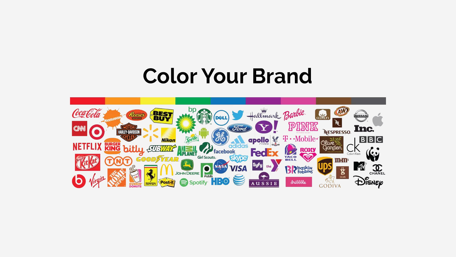
Color psychology is the study of how colors affect human psychology and emotions. It deep dives into the emotional impacts of different colors, and how they can influence consumer behavior in design and branding and bring out specific emotions and responses from viewers. It studies up on the cultural, historical, and personal experiences that shape our perceptions of different colors, and how those perceptions can be used to create a desired effect or message. Then it turns around and flexes this deep understanding with brand recognition.
Wtf does that even mean? Let’s get into it….
Here’s a for-instance:
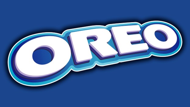
In that “me moment” while standing in the snack aisle of the grocery store, deciding which cookies would best suit your nighttime craving, you grab the Oreos, not because of the yummy flavor, but because of the subconscious feeling the logo gives you.
Why?
Psychology, that’s why!
Blue is a color of approachability and reliability. White is a color associated with purity. Together, they elicit feelings of the familiar. Oreo is your old friend through hard times and good. They’ve been around over a hundred years, and haven’t changed their original product in as much time. Their colors mean consistency, reliability.
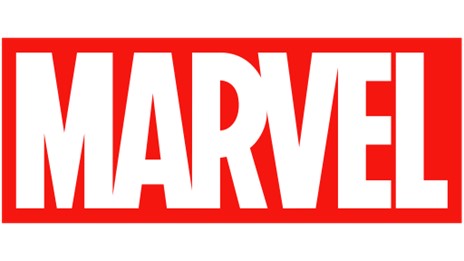
Color has a powerful influence on our actions, thoughts and emotions. Let’s talk about the heavy hitter. Red is the attention-getter. There’s an immediacy to the color that’s engaging, and a little sexy. You’re attracted to it, not just because it’s eye-catching, but also on a subconscious level. Whatever that red logo says, deep down, you want to go there. Because red is enticing!
Case in point…
Meanwhile, green means prosperity and is considered a sign of good taste.
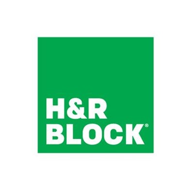
It’s the perfect color choice for your tax professional! H&R Block is a chain of tax preparation shops, and their logo’s goal is to make you feel confident beginning to end when letting them handle your sensitive documents. The viewer has a sense of naturalness and growth. By using primarily green and white, H&R Block says, “we’re sincere and competent.”
Yellow is a balancing act, and one with which we’re quite familiar.

It has the same warmth and power as red, but is best utilized in small doses (too much yellow makes you anxious,) hence the black background. Yellow injects a sense of fun, optimism and creativity to anything it touches, while a darker shade balances with authority and prestige. We chose these colors because we want you to know who we are and what we represent from jump. Massive design/marketing skills knockin’ your socks off!
Hey, we had to do it!
Okay, meanwhile….
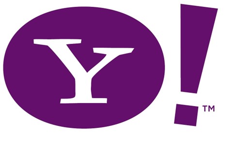
Purple brings something wholly other to the table. Say hello to warmth, sophistication and glam! Quite a high bar for a search engine, but Yahoo has long sought to present itself as something more than a mere linking hub. If your goal is to be a cultural touchstone, then combining the approachability of blue with the fiery attributes of red could be just the purple you’re looking for!
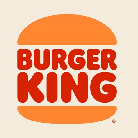
Because orange is associated with want and hunger, many restaurants choose to use it in their logos. It radiates feelings of happiness and warmth….at the discovery of lunch! When mixed with “look at me” red, Burger King is clearly saying, “You saw the sign and you’re suddenly hungry!” Confronting you with sustenance!
Brown is the trickiest of the bunch. It’s earthy, yeah, but also dirty, when used incorrectly or too liberally.

Coffee, of course, comes from the land, and Nespresso’s logo plants it in your brain. Nestle would very much like you to think of them as an earthy corporation in touch with their planet and culture (debatable.) Their logo is simple, eye-catching and communicates sophistication and unity.
….Brown can also represent grief and sadness, so think before you brown.
If your logo is the face of your company, then color is your winning personality.
Do the color choices in your logo best represent your company? What do you want your clients and potentials to feel when they look at you? How will you use color to define your brand identity? Lamesa creative branding agency, UAE, can help you create the brand identity for your brand.
Whether you’re designing, or redesigning, your own logo, or simply fascinated by its underlying psychological attributes in advertising, color is a remarkably powerful tool, and one you can use mightily in your rise to the top.
Choose with care because color is a powerful tool in your arsenal.